Years ago I wrote the blog post, Black and White and Never Read: How to Make Your Resume Stand Out. I still encourage job seekers to make their resume visually stimulating while having solid content about their experience, education and career aspirations.
What do I mean by visually stimulating? Well, if you are a design or marketing professional who sends me a resume in Times New Roman that’s word heavy and clunky to look at, I just think you are not the design maven you say you are. If you are a more analytical type, I can understand if your resume is a bit more straightforward, but you had better list your experience clearly and make your technical knowledge easy for me to understand.
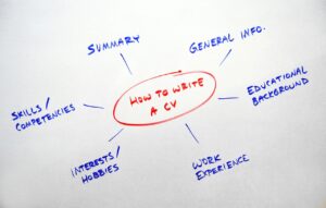
I often refer people to my post about how to write their own resume or LinkedIn profile. I am a hack when it comes to graphic design and will always recommend people to lean on Canva’s tools to create a snappy resume. What should you include in your resume style?
Here are my thoughts on the basics:
- Colorblocking? YES
- Columns and Tables? YES
- Links to your LinkedIn profile or other content? YES (within reason—not sure I need to read your Reddit posts about action figures).
- A picture? YES, as long as it is a good picture of you and shows you in a good light. I recently advised a job seeker to change his resume picture because the image made it look like he was smoking a cigar when in reality he was drinking a red wine and the wine was visible but not the glass.
- Bulletpoints? What do you think?? YES!
How to Get Ahold of You: Another thing I need to remind people about is that they had better have their name, phone number and email address correctly written on their resume. I know, seems simple, but too often when reviewing your own resume you miss the basics. Placing your contact information in headers can also cause trouble, so I say avoid headers and footers as much as possible.
LinkedIn: Throw in your LinkedIn profile link. If you’ve been building a brand and your closely involved in the business, add the link to the company. It really helps us recruiters get a glimpse of your work product.
Little Things that Matter: Color, design elements and white space are all important things to consider when doing your resume. While you may be trying to cram a bunch onto one page, if it is so dense that it’s hard for my seasoned recruiter eyes to read, I may miss that key element in your resume that means we’ll be on the phone right away.
Whitespace, Yes: Leave some white space throughout the resume. A resume that is one or two pages in length is suitable for almost anyone. I have plenty of executives who highlight their suitability for a search I’m working on with a one-page resume. I’ve heard you should avoid a one and half page resume at all costs. Not sure it’s a deal killer but think about how you can have one or two complete pages of information.
So, send me those updated resumes. And if you add color, I’m partial to orange used in colorblocking.


